CAA News Today
Introducing the New CAA
posted by CAA — Feb 27, 2018
A New Look for CAA
As we look to build CAA in the future, with new and energized staff, new programs that will assist all of us in our professional lives, we have given the organization a new look and a name more focused on how our members know us after many years of service. We unveiled our new logo, new name, and new branding colors at the 106th Annual Conference last week in Los Angeles.
For decades, people have used the term “CAA” as a nickname for the Association. Many of our members feel connected to the words, College Art Association, but many others, especially new members and prospective members, feel these words don’t resonate with them. We started the renaming and rebranding process in spring of 2017 with the retention of a professional design and branding firm called Briteweb, which works exclusively with social sector organizations. This fall, as part of the research process, CAA and Briteweb held workshops, surveyed the current and past membership, and conducted interviews with long-standing and new members, as well as other arts professionals.
Nearly 1,500 members and members of the wider CAA community contributed to surveys and questionnaires about a new name and mark for the organization. As part of the process, we not only looked internally at our own membership but also at the marks of similar societies and organizations. To shepherd the process, CAA established a Branding Subcommittee, which reviewed and synthesized all of the ideas coming from membership and from Briteweb.
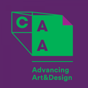
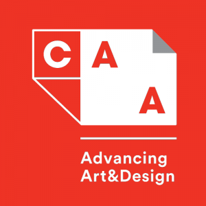
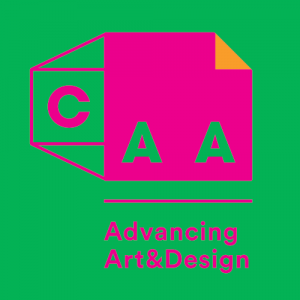
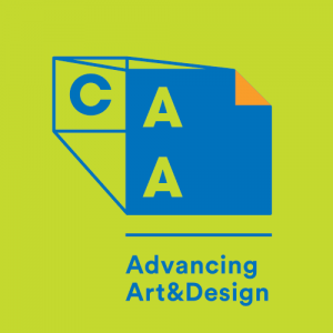
Last December we reached the first major milestone in the renaming and rebranding process. The Board, informed by member feedback, unanimously voted to simply call the organization CAA and to add a tagline ADVANCING ART & DESIGN to be used in coordination with the three letters.
Then we built a new logo. We built the new logo by thinking about the field, about our collective passions and interests, and the work we work we do every day. We narrowed down to two core components: the frame and the page. We used these symbols of the lives and work of our members as the building blocks of the new visual identity. They represent what we study, what we teach, what we practice, and what we create. We spend endless hours looking at, thinking about, writing about and reading about art.
We also wanted the idea of flexibility to be part of CAA’s new identity so we’ve adopted a logo system that can change as we do and as the field does. And the color palette was, of course, very important to us. We wanted to inject vibrancy and lots of color into our new logo system.
But change is more than a logo. This is about a shift in how we work to assist everyone in the field. A new look necessitates action. This is about more opportunities to present papers at the conference. This is about more opportunities to publish articles. It’s about more opportunities to network with colleagues. It’s about more opportunities to advocate for the field. It’s about beginning to think seriously about attracting otherwise marginalized communities to be part of the field.
This is the future of CAA.
A Brief History of 107 Years of Branding at CAA
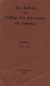
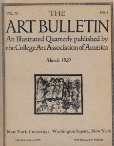
From its inception, the College Art Association understood the importance of its name. Publications like The Art Bulletin (founded in 1913) and Art Journal (founded in 1941) have proudly touted the name of the organization.
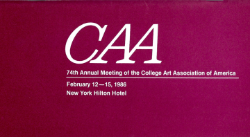
But formal branding and styling did not arrive until the 1950s when a modernist approach was adopted.
It was not until decades later, in the 1980s, that an official CAA logo took shape. The CAA logo of the 1980’s angled forward in all capital letters and had conjoined A’s.
In 2012, the CAA logo many know was born.
The new CAA logo dropped its height to use lowercase letters in a sans-serif font that was overlaid with swooping and intersecting lines.
![]()
Murmurs and Decisions
For years, discussion has brewed among the CAA board of directors and members about a name change and new branding for the organization. The decision was formally written into the 2015-2020 CAA Strategic Plan.
In spring 2017, work officially began. CAA issued an RFP for the redesign and renaming of the 107-year old organization. The firm Briteweb, which specializes in branding for the social sector, was chosen as the best fit from eight other firms.
Step 1: Renaming
Feedback. Feedback. Feedback. The first step on the path to renaming the College Art Association (CAA) was gathering feedback from our members and stakeholders. A survey went out to all members, current and lapsed. Phone calls and interviews took place with stakeholders and board members. We learned a lot.
“Overall, it seems to me that the goal should be to figure out how to make sure that everyone who has a stake in teaching art, design, art history, curatorial and museum practices at the college level understand that they are included and welcomed—that it is their professional organization.” –CAA member survey response
Feedback we received from our members told us how CAA matters to them, where we can improve, and where we should focus our energy as we move into the future.
Step 2: A Tagline That Fits
Members told us that CAA has to move forward. You told us that we have to be there for the next generations of students and scholars in the arts and humanities. We have to advance the field by supporting the field. Our tagline was born.
“Advancing Art & Design”
We also learned that there was immeasurable value packed into three letters—CAA. We explored different acronyms, new names, and different words to fit CAA. But in the end, it came down to the letters CAA being the sole representation of the organization as it moves into the future, stepping up a role they have already played for decades.
Step 3: A Logo is Born
With our name settled, it was time to design. What does advancing mean visually? How can we encompass the many professions and personalities of our membership in a visual representation? Rounds of designs were reviewed.
We wanted risk, but not too risky.
The new CAA logo includes nods to the frame and page, two crucial elements of our members’ lives. It has dimensionality and flexibility. Just like our members.