CAA News Today
CAA Introduces New Logo and Launches Redesigned Website
posted Sep 28, 2010
 For our one-hundredth birthday, CAA got a face-lift. And don’t we look great? You’ve probably seen our new look trickle out over the past month on CAA’s Facebook and Twitter pages, for example, and on organizational letterhead. The complete design transformation launched full throttle last Friday with a revamped homepage and changes made site-wide.
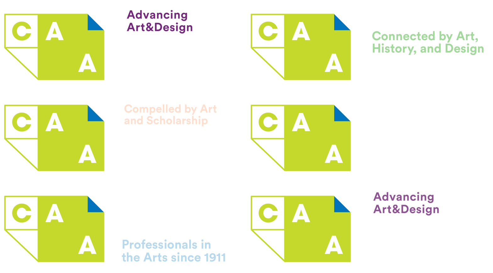
In planning the upcoming Centennial year, CAA board and staff desired to celebrate past achievements while focusing significantly on the future. The old CAA logo, used since the mid-1970s, had worn out. A fresh identity with a more creative character, we felt, would appropriately signify CAA’s leadership in our quickly changing, adaptive field.
LaPlaca Cohen, a marketing firm specializing in arts and culture, had recently assisted CAA during the 2010–15 strategic-planning process. Since that team already possessed a deep understanding of CAA’s mission, vision, history, and membership, it was only natural that they help conceptualize our new look. Tom Zetek, director of creative services and production at LaPlaca Cohen, says, “The dynamic stance of the logotype is meant to depict the progressive nature of CAA. The fluid, looping sketch element with the logo reflects the creative roots of the organization.”
CAA’s Centennial Celebration, which begins at the 2011 Annual Conference in New York and ends one year later at the Los Angeles meeting, presents you with a unique opportunity to help refine our purpose and core values, and to influence and activate everything we do. For many, CAA represents a professional community; for others, it’s a wellspring of opportunity. We’d like to know what CAA means to you. Please send your comments on CAA’s identity to centennial@collegeart.org.


